Redesigning Metronails.com

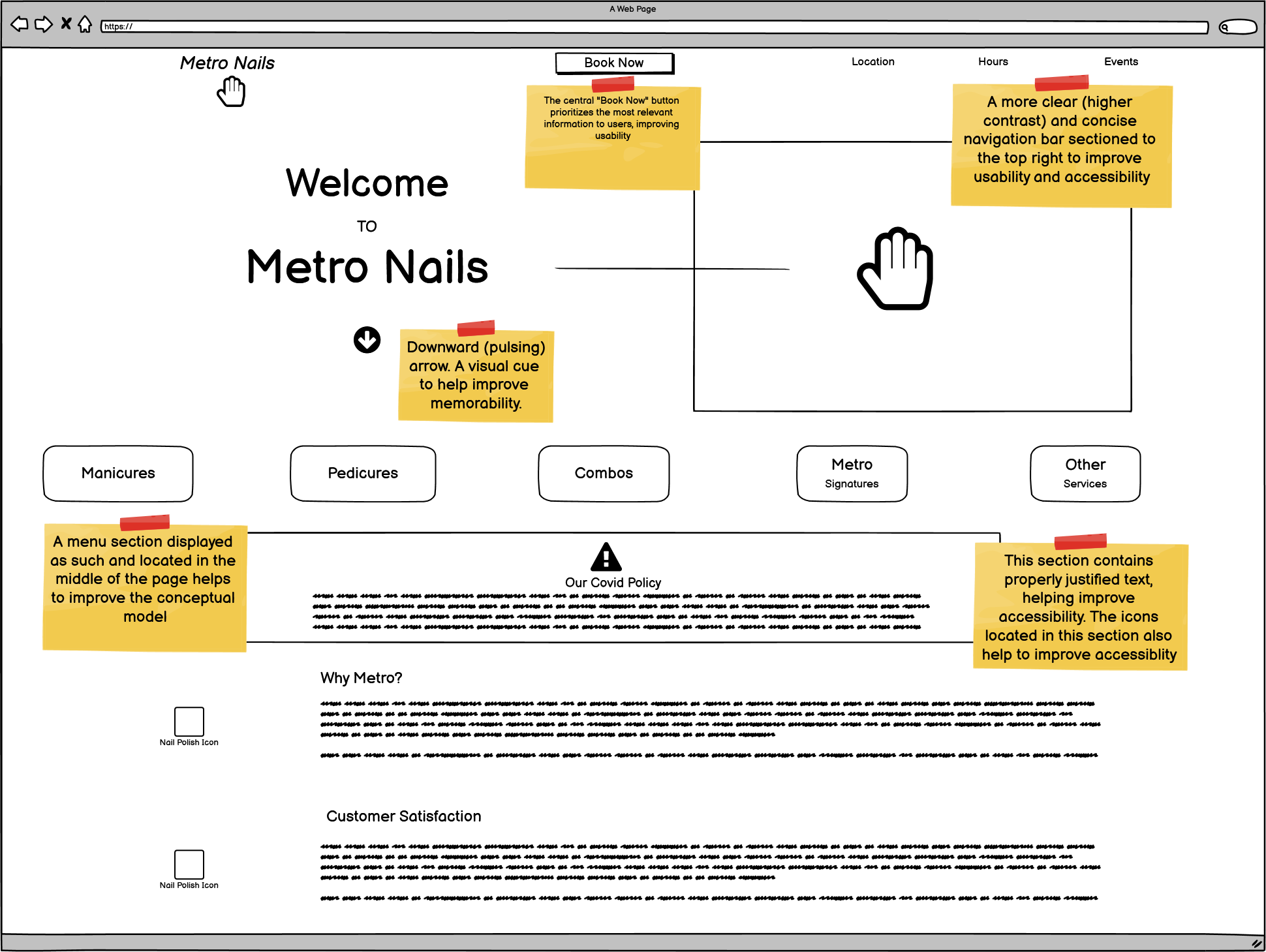
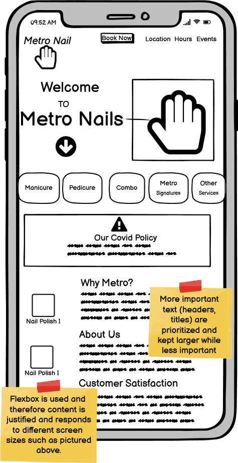
Overall, the Metro Nails landing page did not test well on usability. Explore the infographic below to look at my full analysis or look at it here!
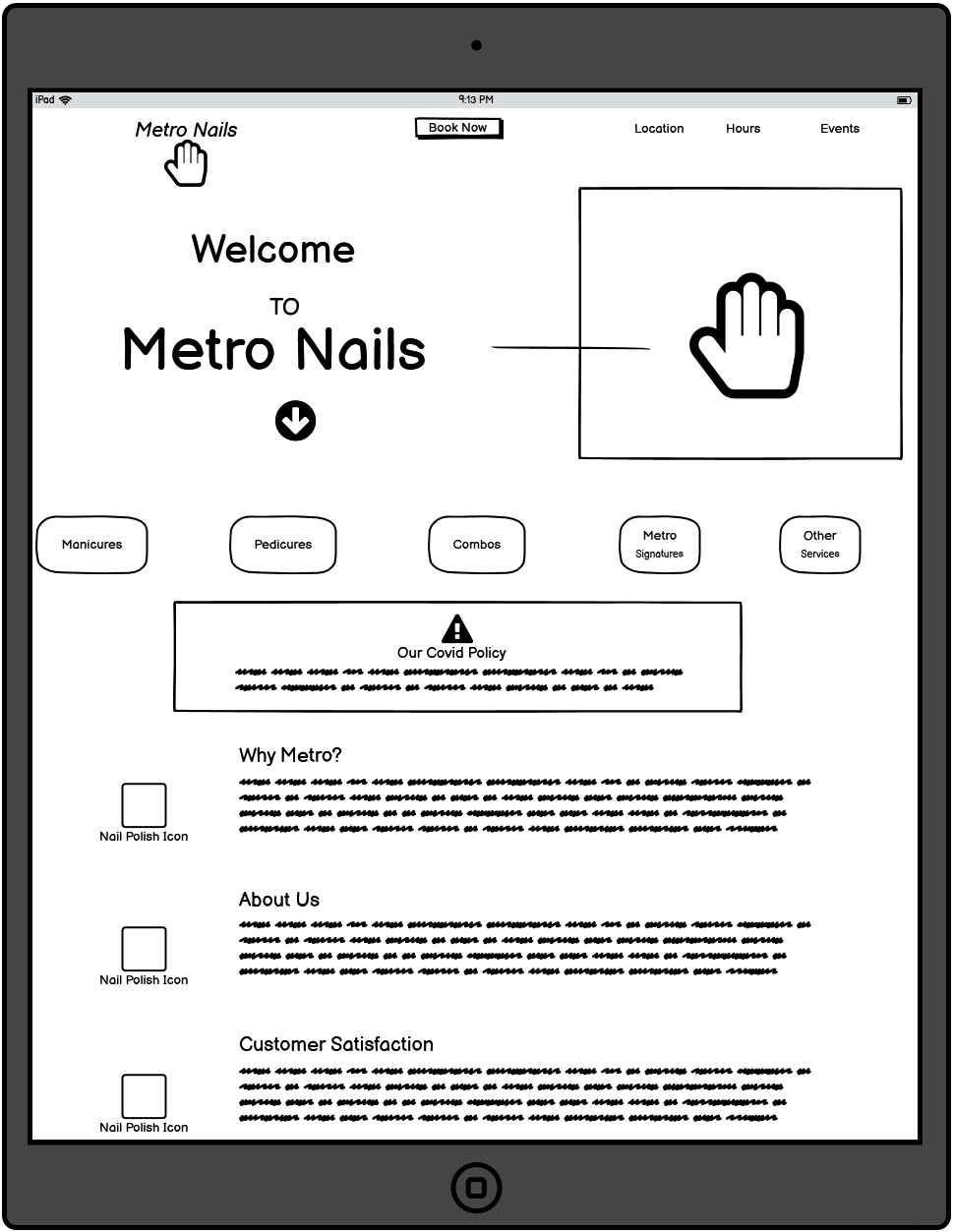
After exploring the usability of the current Metro Nails site, I went to Balsamiq Wireframes to create some lofi prototypes. Below are the three lo-fi prototypes, created using Balsamiq Wireframes. The three wireframes are designed for a desktop, phone and tablet, respectively. The prototypes are annotated with notes that mark the usability improvements.
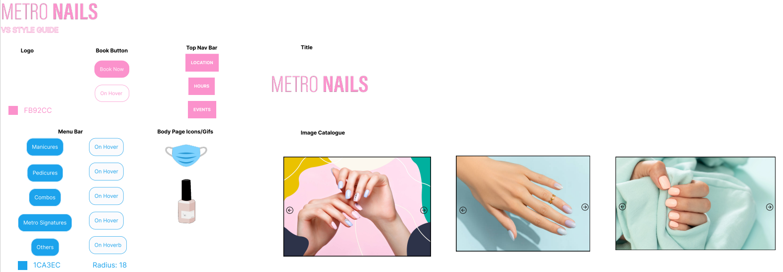
After having constructed my lo-fi prototypes I created a visual style guide prior to constructing my hi-fi prototypes. The visual Style Guide is located below or you can find it here!
The final step before creating the actual redesign was to do my hi-fi prototyping. Your can find the hi-fi prototypes for a browser, tablet and phone below.
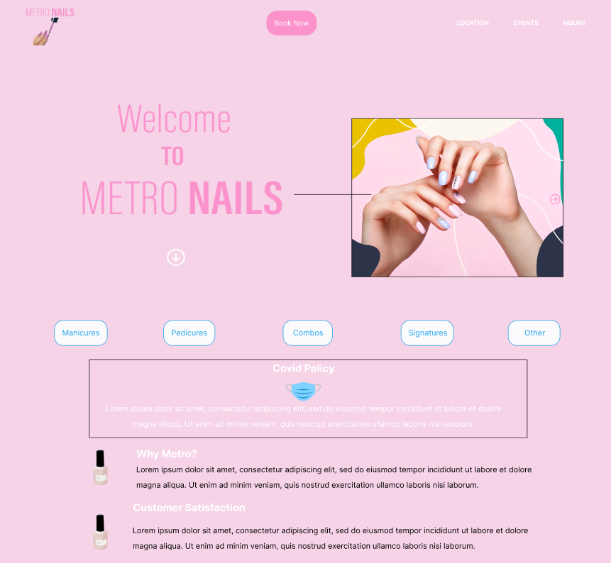
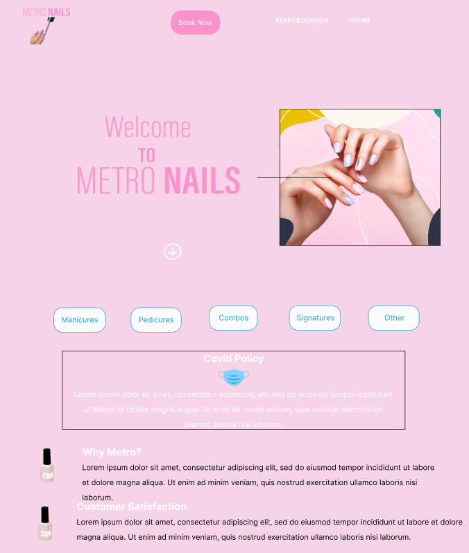
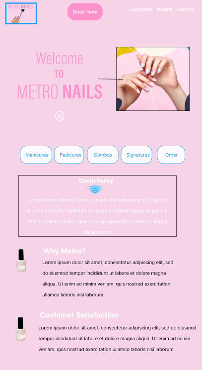
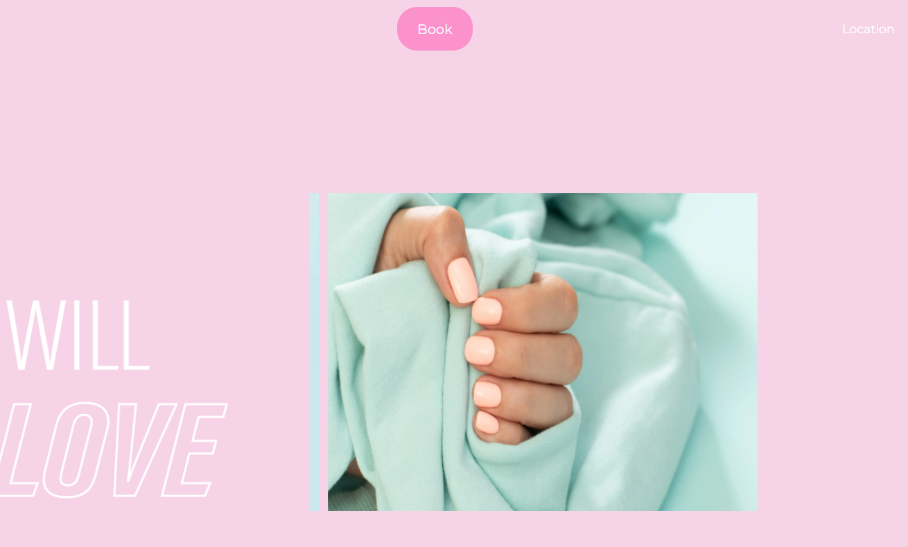
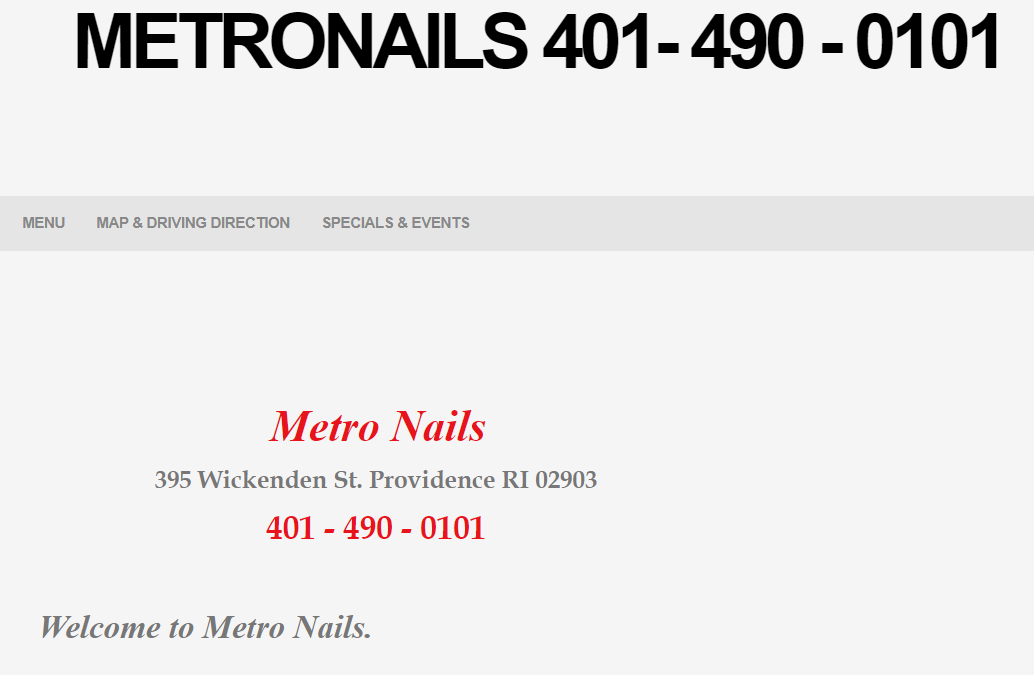
Click on the image to the left to visit the redesigned webpage and the image to the right to visit the original.